Most pixel art scenes you see in beginner tutorials suffer the same problem: every element sits on the same plane. The character, the tree, the building, the distant mountain — all sharing the same crisp outlines, the same color saturation, the same level of detail. The result reads like a sticker sheet, not a world.
The fix isn't more pixels or a fancier engine. It's four composition tricks that landscape painters have used for 500 years, ported to a 2D grid. Once you know them, you'll see them everywhere in shipped indie games — Dead Cells, Sea of Stars, Hyper Light Drifter, Octopath Traveler.
1. Overlapping Silhouettes — Let Foreground Eat Midground

The single biggest depth cue is occlusion: when one shape covers part of another, your brain reads the cover as "in front." That's it. No lighting trick, no color magic — just shapes interrupting other shapes.
Beginners often place every sprite in its own tidy box, with clean margins. Painters do the opposite. A 17th-century Dutch landscape will have a tree branch poking 30% across the cathedral spire behind it. The disrespect for boundaries is the depth.
In pixel art:
- Place foreground characters so their silhouette breaks the horizon line of midground buildings
- Have a tree's foliage cover the corner of a roof, not sit politely beside it
- Push the player sprite so its head overlaps the upper edge of a tile, not the center
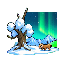
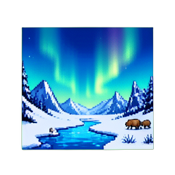
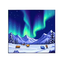
Sea of Stars (Sabotage Studio, 2023) does this constantly. Pause in any forest scene and you'll see character sprites whose tops disappear behind canopy tiles. The world feels traversable because the layers refuse to behave.
2. Atmospheric Perspective — Wash Out the Distance
Walk outside on a hazy day and look at a mountain. The mountain isn't gray because it's painted gray — it's gray because 5km of air sits between you and it, and air scatters short-wavelength light. Distance desaturates color and shifts hues toward cool blue or violet.
This is atmospheric perspective, and it's the cheapest depth trick in the book.
In a 32-color pixel palette, you don't need a separate "distance" palette. Pick 4–6 of your existing colors that lean cool (a desaturated blue-gray, a dusty mauve, a foggy pale green) and use those exclusively for far-background tiles. Save the saturated reds, oranges, and pure whites for the foreground.
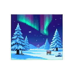
Hyper Light Drifter (Heart Machine, 2016) is the canonical example. The far mountains are 2–3 colors, all cool. The mid-distance ruins are 5–6 colors, neutral. The character and immediate enemies pop in saturated magenta and cyan because they're the only sprites allowed those colors. Your eye reads depth from saturation gradient before it reads anything else.
A common mistake: applying the same palette to every layer "for consistency." Consistency kills depth. Tonal hierarchy is what binds a scene, not uniform color.
3. Detail Density Gradient — More Cracks Near the Camera

Look at any landscape painting from the Hudson River School. The rocks in the foreground have moss, fissures, individual leaf veins. The rocks 200 meters back are smooth lumps of color. The rocks at the horizon are silhouettes.
Same principle, on a 2D grid: detail density should fall off with distance.
In pixel art that means:
- Close-camera assets (player-touching tiles, picked-up items): 1-pixel highlights, individual textures, multiple shading tones
- Mid-distance assets (background buildings, mid-trees): chunky blocks of color, simple cel shading, no per-pixel highlights
- Far-distance silhouettes: 2-tone shapes, no internal detail at all
Octopath Traveler (Square Enix, 2018) inverted this for stylistic effect — its HD-2D pipeline keeps every layer detailed and uses tilt-shift blur to fake depth. Most teams without that engine should stick to detail falloff: it costs nothing in tooling, just discipline in how you draw the further-back tiles.
If your far mountains are as detailed as your hero's belt buckle, you've collapsed the scene into a single plane.
4. Parallax With Intentional Spacing
The fourth trick is the only one that needs engine support: parallax scrolling, where layers move at different speeds relative to the camera. Far layers move slowly, near layers move quickly, and your brain reads the speed differential as depth.
The trap is treating parallax as a slider you tune by feel. Pick numbers:
| Layer | Distance (meters) | Scroll rate (relative to camera) | | --- | --- | --- | | Sky | ∞ | 0.0 (locked) | | Far mountains | ~1000m | 0.1 | | Mid mountains | ~300m | 0.25 | | Trees behind action | ~30m | 0.5 | | Action plane | 0m | 1.0 | | Foreground grass blades | -2m | 1.2 (faster than camera) |
The "faster than camera" foreground layer is the secret weapon — a thin grass-blade or branch silhouette that scrolls at 1.1× to 1.3× the player's speed gives the scene immediate Z-depth that nothing else does. Dead Cells (Motion Twin, 2018) uses this in nearly every biome.
Six layers is a lot for a small team. Three is plenty: distant, action, foreground. The point isn't quantity — it's intentional spacing. Don't put two layers at 0.4× and 0.5×; the eye won't separate them. Spread the layers logarithmically, not linearly.
Pulling It Together

The four tricks compound. A scene with overlapping silhouettes but no atmospheric perspective looks busy and flat. A scene with atmospheric perspective but no detail gradient looks faded and flat in a different way. You need at least three of the four to sell depth.
A diagnostic: take a screenshot of your scene, blur it lightly, and ask yourself "can I still tell what's near and what's far?" If the answer is no, you've collapsed everything onto one plane. The fix is almost always more saturation contrast (trick #2) or more silhouette overlap (trick #1).
These are 500-year-old tricks. Painters figured them out without engines, without editor sliders, without parallax tween coefficients. They worked because human visual perception hasn't changed since the 17th century. A 2D pixel grid is just a different paint surface.
Your scene doesn't look flat because pixel art is inherently flat. It looks flat because every element is shouting equally. Quiet some elements down, push some forward, and the world appears.