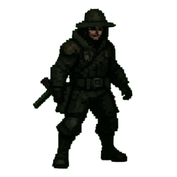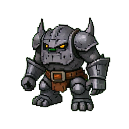
Squint at a Mario sprite, fill it with pure black, and you still know it's Mario. The hat shape, the proportions, the body posture — all of it survives the loss of color, line work, and detail. Mario reads as Mario from his silhouette alone.
Now try that with your protagonist. Fill them with black. Place them next to your enemies, also filled with black. From 3 meters back, can you still tell who's who?
If the answer is no, the sprite has a silhouette problem. And silhouette problems are the most common cause of "my character looks generic" in indie pixel art.
1. Why Silhouettes Beat Color, Line, and Texture
The human visual system processes shape before color. This is wired into the retina: rod cells (luminance and shape) outnumber cone cells (color) roughly 20:1. Distance, motion, peripheral vision — all of these flatten color but preserve shape. Mid-combat, with the camera moving and effects everywhere, your sprite reads to the player through silhouette and silhouette alone.
This is why Team Fortress 2's character lineup was designed silhouette-first. Why every Mega Man enemy looks distinct in black-on-white. Why Hollow Knight's bestiary tells you what each enemy does just from its outline.
2. The 5-Second Test
Open your sprite in any image editor. Fill it with pure black. Now run three checks:
- Squint test: Squint at the sprite from 1m away. Can you still tell what genre it is? Warrior, mage, scout, monster?
- 3-meter test: Step back 3 meters from your monitor. Can you still tell the sprite from the background?
- Lineup test: Place 3–4 of your character silhouettes side by side. Are any two confusable?
If any test fails, the sprite needs more silhouette differentiation. Fixes are usually one of:
- Larger or angled headpiece (hat, helmet, ears, antlers)
- Held object (weapon, staff, lantern, satchel)
- Body asymmetry (cloak on one shoulder, pouch on one hip)
- Pose break from neutral (one leg forward, leaning, weapon raised)
3. The Mirror-Symmetric Trap
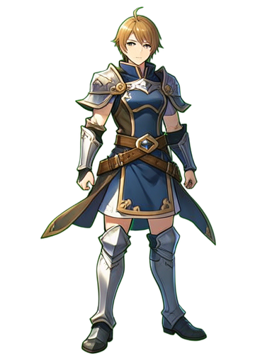
The most common silhouette mistake: drawing a character standing perfectly upright, arms at sides, legs together, head centered. The result is a near-perfect vertical mirror that reads as a featureless blob.
Look at any iconic shipped character and you'll find asymmetry:
- Mario: one arm bent at the elbow, one at the side, hat tilted
- Link: shield on left arm (asymmetric), sword behind back, hat to one side
- Crypt of the Necrodancer's Cadence: hair swooping to one side, headphones forward
- Hollow Knight: cloak draped asymmetrically, nail held to one side
Asymmetry doesn't mean "wonky." It means breaking the mirror so the silhouette has a left side and a right side that aren't identical.
A centaur is the extreme version — the horse body forces asymmetry by construction. You don't need a horse body. A held lantern, a slung satchel, a cloak draped one direction will do the same job for a humanoid.
4. Size Hierarchy Is a Silhouette
When you have a hero, minions, and bosses, the size relationship between them is silhouette information. A small distinct sprite next to a large sprite reads instantly as "follower" or "pet." Same pose, same color palette, but the size differential carries meaning.
Pixel art rules of thumb:
- Hero: 24–32px tall (on screen, before scaling)
- Minion or pet: 12–16px tall (about 50% of hero)
- Boss: 64–128px (2–4× hero)
- Final boss: 128–256px (often takes a 4-screen vertical scroll)
If your hero and your boss are the same height on screen, the boss doesn't feel like a boss. Hollow Knight's Hornet is a memorable mid-boss largely because she's the same height as you (an unsettling silhouette equality), and then Radiance towers four times your height at the end and feels like a different game.
5. Genre Reads Through Silhouette
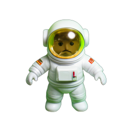
A pointy hat = wizard. A round helmet = astronaut or robot. A long coat with epaulets = naval officer. A skull on a stick = necromancer. A bow held drawn = archer.
These are silhouette tropes that the audience already speaks fluently. You don't have to invent new ones. Pick the silhouette that matches the genre, then differentiate within it.
Hades does this masterfully: every character is instantly genre-legible (Hermes is a winged messenger, Hades is a broad-shouldered king, Megaera is a winged warrior) but the silhouettes are also unique enough within the cast that nobody is confused for anyone else.
If your "elf archer" doesn't read as an archer in silhouette, give them a bow held out. If your "wizard" doesn't read as a wizard, taller pointier hat. The tropes work because they communicate before color does.
6. Weapon as Silhouette Extension
A held weapon often is the silhouette. A staff doubles the character's vertical line. A two-handed greatsword extends the silhouette horizontally. A drawn bow creates a triangle.
Use this. A character holding a weapon mid-pose reads faster than a character with arms at sides. The held object also signals the character's role to the player.
A trap: if your protagonist drops their weapon mid-combat (or has an unarmed state), their silhouette collapses. Make sure the silhouette still reads when the weapon is gone — usually via the headpiece, cloak, or pose. Hollow Knight handles this by keeping the cloak and horns distinctive even when the nail is sheathed.
Diagnostic Workflow
When you finish a character sprite, before shipping it:
- Convert all pixels to pure black (or a strong dark color)
- Place it against your most common background tile
- Step back 2–3m from the monitor
- Ask: can I tell what this is? Can I tell its genre? Can I tell its mood?
If three of those fail, the sprite needs silhouette work, not detail work. Adding more pixels won't fix a shape problem. The 5-second test is the cheapest QA pass in pixel art — no tools, no engine integration, no extra art time. And it catches the single most common mistake new pixel artists make.